
No, this is isn’t a piece about a dodgy-sounding New York law firm. Nor is it about a potential plan to get rid of the Winterpause and play Bundesliga matches through snowy months. No, it’s Trikot-time again, and the imminent launch of the Nationalmannschaft’s new on-field uniform for the upcoming World Cup in Brazil next year.
Making its debut against Italy later this month – funny, but Italy has always been a popular opponent for showcasing new Trikots – the team will walk out in a look that has made many followers of German football sit up with a start. There have of course been some “interesting” designs before – the 1994 “eagle/chessboard” and the overly baggy 1998 edition to name but two – and this one is no less innovative with a three-tone red chevron across the chest.
The big talking point however is not so much the shirt, but the replacement of the famous black shorts with white ones. Making the team Weiß und Weiß as opposed to good old Schwarz und Weiß.
While I am clearly not going to set about changing the name of this site to “weissundweiss.com” or “realmadridwitharedchevron.biz”, I am rather annoyed by this. Those behind this design faux pas have called it a “break with tradition”, but I am left scratching my head. The black shorts are not just tradition – they are, quite simply, iconic. When you think of those famous images of Helmut Rahn, Fritz Walter, Franz Beckenbauer, Gerd Müller, Karl-Heinz Rummenigge, Lothar Matthäus, Jürgen Klinsmann and Ronald Maul, one always sees the white shirt with black shorts. Not some fashionably chic copy of Real Madrid.
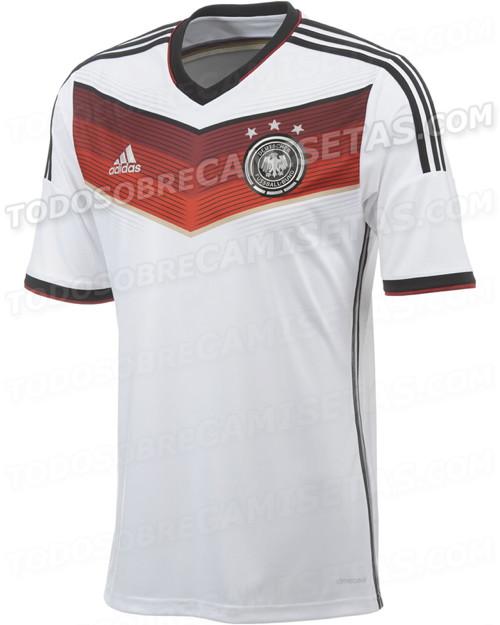
So, what do I think of this design? Well, after being slightly disturbed by a number of “leaked” prototypes which had anything from massive triangular neck designs through to purple and pink chevrons, I have to say that it is not bad. Well, nowhere near as good as some other recent examples, but not that bad. There’s far too much red, too little black, way too little gold and I have never been a massive fan of the white/silver on black eagle crest, but it’s a design that might well grow on me – much like the 2008 design which didn’t really appeal at first.
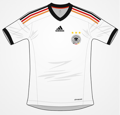
I have often wondered where the ideas for these kit designs come from – do those mad hipster scribblers in those bright and overly airy rooms in Herzogenaurach with the air conditioning turned on full blast actually speak to the players? I dare not ask if they speak to the supporters, the people who will end up shelling out the cash to buy the shirts. For if they did, we’d probably end up with something simple and smart, like this. (Thanks to @transmission on Big Soccer and footballtemplates.blogspot.de for the mockup).
That all being said, shirts will change every two years before every major tournament. They have to be different. They have to be – cough – fashionable. While it’s nice building up a collection of national team shirts as it is one more thing to talk about, part of me would just like to have one standard kit and have done with it – white shirts, black shorts and a little splash of Schwarz-Rot-Gold.
As for the Auswärtstrikot, numerous “leaked” prototypes for the design that will replace the current Lindengrün incarnation have also been floating around the Internet. The most likely one is a red and black “hoop” design, which looks a little like the shirt sported by Brazilian side Flamengo and reminds me of the QPR away shirt from the 1980s. From what I have seen this design – which includes a “vintage style” button up collar, looks OK enough when paired up with black shorts – which hopefully the team will end up wearing with the white home shirt.
The away shirt is set to make its first public appearance early next year, probably against Chile in Stuttgart in March – more on that then.
One of the underlying memories I have of the ’74 WM was Germany wearing four variations of their kit in the 7 games!! The usual kit as we all knew it v Chile & DDR; the ‘V’ collar v Yugoslavia; the green away tricot v Australia & Sweden and the all-white v Poland. My favourite home kit was also ’82 (shame about the team!) and my favourite away kit was the one they wore (just the once) in the England game in September 1991 at Wembley.
I too loved the 1982 Trikot, but the 1986 green one had a certain something about it. It’s a shame that the market was not geared to fan sales at that time as I would have definitely had one of those!
Yes, the 1991 green one-off was superb… I was at that match, so at while I don’t actually have the shirt I was able to see the team play in it!
I’ll be wearing my 2010 shirt next summer. It’s a nice clean look. Isn’t there anyone who sees a problem with Germany wearing white, red, and black? If colors will be prominent, they should be schwarz, rot, gold.
Eric, you have pointed to the elephant in the room. I did think of it, but didn’t want to go there. I agree, it should be Schwarz-Rot-Gold – or just Schwarz und Weiß.
I agree – a way it could have been designed with the black to fade into red or a light grey, then the Red (ff0000) fade into an orange or yellow and same with the yellow into white.
I may just give this a try. BTW – I’m still not too fond of it, but like you said, maybe one gets ued to it.
I quite like the sound of that Hans… It would be better than a three-tone red I think.
Yes, I think I will get used to it when I see it, and will definitely be adding it to the collection!
the 2 trikot is the best. My all time favorit is of the wc in 1982…in 1994 was ugly!!
Gruessen auch!!
Hello “Der Chef”,
I think it’s far too pink well clearly for my liking…
I am not shelling money out for this…
Because I am going to stick with the good old traditional Schwarz und Weiss with the added Rot and Gold.
1954, 1974 and 1990 lassen gruessen…
Regards
Der Fischkopp