Colours
Home: White shirt with black trim and horizontal Schwarz-Rot-Gold stripes, black shorts, white socks
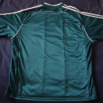
Away: Green shirt with white trim and white vertical broad stripe, white or green shorts, green socks
Overview
Coaches: Berti Vogts, Erich Ribbeck.
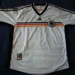
The white home shirt that was launched in 1998 for the World Cup in France could best be described as a fashionista’s delight – it actually looked as if it had been created more with the supporters in mind than the players, from the large and airy sleeves right down to the scalloped base that was clearly designed to look just as good off the field as on it. Truth be told, it was not really my favourite design in that while the essential features looked good there was far too much going on. Evidently the folks at Adidas had not applied the basic principle that had defined the design of the 1996 effort – less is more.
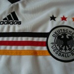
The basic layout of the shirt was simple enough – black v-neck with white piping, a very simple thin ribbed pinstripe effect, three “traditional” black stripes down the shoulders and a new play on the use of Schwarz-Rot-Gold in the form of three thin horizontal bands across the chest. So far, so good.
Then things started to get a little elaborate. Instead of the sleeves tapering off slightly, there was a slightly wider and thicker “cuff” – which looked a bit like it had been folded inwards – piped in red. It didn’t really look right, and was to me slightly out of keeping with the basic principles of football shirt design – proven by the fact that it looked rather ridiculous on Jürgen Klinsmann when he was wearing the Spielführer’s armband. Then there were the black side panels, which was a design feature that could easily have been left out: plain white had always worked best.
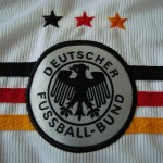
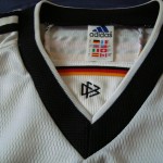
While I rather liked the idea of the three horizontal Schwarz-Rot-Gold bands running underneath the national eagle, I was never really won over by the look of the national crest itself on this design. Firstly, the containing disc – topped by the three stars in Schwarz-Rot-Gold – was way too large. Secondly, the thicker black outer circle just didn’t look that good. Likewise, the look of the simple and effective black v-neck was ruined by the introduction of the unnecessary triangular inner section containing the DFB logo and a band of Schwarz-Rot-Gold.
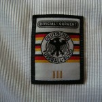
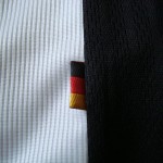
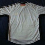
While the basic horizontal three-band design clearly worked, the overall look would have been better served had this been the only instance of colour; instead, there were smatterings of Schwarz-Rot-Gold all over the shirt, including three small stripes on the back of the neck and a small “flag” tab on the side. Even the “official garment” label applied to the lower left of the shirt could have done with being a bit less elaborate.
Jürgen Klinsmann in action at the 1998 World Cup in France, modelling the baggy Heimtrikot
The white home shirt was as always worn with black shorts, the design of which featured a wide white panel on either side with three thin vertical stripes – with the bottom of the legs having a “turned-up” look piped horizontally in red and gold. While being slightly better than the overcooked 1994 design, it was far less simple and elegant than that sported in 1996. The “large circle” national eagle crest was sported on the left leg. Even the socks saw a design change, with the three horizontal bands at the top being replaced by three vertical stripes extending from the top to the ankle.
Truth be told I cannot think of one great game played in this shirt. OK, there was the comeback against Mexico in the World Cup second round when Oliver Bierhoff popped up to score the winner, but the most abiding memory I have of this design is the depressing 0-3 defeat to Croatia in the quarter final. If I were to associate a particular player with this shirt, the first picture that flashes through my head is that of Christian Wörns trudging off after being given a red card following some Davor Suker theatrics.
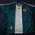
The time that had been spent in creating the white home shirt was clearly lost on the green second one, which can only be described as one of the ugliest designs ever sported by the Nationalmannschaft: dark racing green with a large white vertical band in the middle and a white and green v-neck that clearly failed in trying to create a retro look.
Apart from some neck to armpit white piping, a black woven Adidas logo and the “official garment” tag applied to the lower left, there were no other design features on this shirt; even the large sewn-on white disc containing the national eagle looked as though it had been added as an afterthought in that it provided a rather odd contrast with both the dark green material and the three stars above it. A white woven eagle on the green background would have looked a lot better, but instead the designers decided to re-use the design that was clearly made for the white shirt.
Kitted out in the Sunday League Auswärtstrikot, Jens Jeremies is challenged by Finland’s Aarno Turpeinen
Accompanying the green shirt were white shorts that followed the same basic design as the black home ones – white with wide green panels, which were adorned with the three stripes in white. Completing the ensemble were green socks with three vertical white stripes. As an alternative, green shorts were also worn with the green Auswärtstrikot.
In short, the Auswärtsrikot from 1998-2000 looked a little like the sort of thing worn by a Brandenburg Sunday League side; replace the eagle with a stylised horse and cart, and it could easily have been the sort of thing worn by 1. FC Nondescripts and washed every morning by old Frau Schmidt before being put through the mangle.
In what was perhaps the perfect illustration of how far German football had sunk, Ribbeck’s team would wear this all-green combination in a 1998 Euro qualifier against Turkey In Izmir, losing 1-0 courtesy of a truly horrible Oliver Kahn own goal. The finishing fashionable touch was provided by the green shorts, labelled with the old-school Adidas trefoil and missing the national crest.
Jens Jeremies in the green shorts ensemble, crowded out by a group of Turkish defenders in Izmir
It would be quite fair to say that the Sunday League shirt went very well with the poor and insipid football produced by the German team whenever it was worn; the only victory I can recall when this shirt was worn was a scrappy and highly unentertaining 2-0 win by Erich Ribbeck’s charges over New Zealand in the 1999 edition of the Confederations Cup – a scrappy affair with the goals being scored by the journeyman Michael Preetz – yep, Michael Preetz – and the ageing Lothar Matthäus. Then there was that truly dreadful 1-0 defeat in Turkey.
Tournament Record
1998 FIFA World Cup, France: quarter-finalists
1999 FIFA Confederations Cup, Mexico: first round
Shirt Debuts
White: v Brazil, 25.03.1998, Stuttgart.
Team: Köpke – Thon – Wörns, Kohler – Heinrich, D. Hamann, Helmer (81. Babbel), Ziege (68. Tarnat) – A. Möller – Klinsmann (46. Kirsten), Bierhoff
Score 1-2 (Kirsten 65. / César Sampaio 27., Ronaldo 88.)
Green: v Finland, 27.05.1998, Helsinki.
Team: Köpke (46. Kahn) – Wörns, Kohler (46. Babbel) – Matthäus – Heinrich (68. Jeremies), Freund, D. Hamann (73. Thon), – Tarnat – Häßler – Bierhoff, Kirsten (46. Marschall)
Score 0-0.
Shirt Images
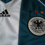
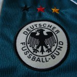
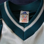
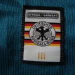

Ha Ha! It’s true!! I had forgotten completely about Klinsmann running around looking all goofy with one of his arms like it was sticking out of a tied up sack!
The good part of this Trikot though, is that it’s ample design helps hide my waaaay more ample-than-in-98 beer belly! And something can be said about the materials: 16 years and many, many uses later, it still looks brand new!
“Sticking out of a tied up sack”. Ha, that sums up the look rather well! That design was indeed unique in many ways!
1.FC Nondescripts! Ha Ha! Loved it.
This home shirt was the first I could ever afford, saved a lot of money to purchase the original. Hell, even then I thought I was ripped off, as the supposedly ‘L’ chest seemed to be sewn to ‘XL’ Sleeves! But still, I love it, as the 98 campaign was one of personal glory, even if the Mannschaft had it rough. Thanks for this website!
So it wasn’t just me who thought the sleeves were too large, then! It really was a “fashion” design, to the point where in combination with the captain’s armband it looked a little ridiculous…