
Back in early November of last year, the DFB officially released the current home Nationaltrikot. Replacing the short-lived design worn during the Confederations Cup last summer, the new layout took its cue from the famous “flag” shirt of the late 1980s and early 1990s, evoking memories of the Mannschaft’s victory at Italia 90.
After months of the usual media gossip and internet leaks, the new Auswärtstrikot was finally revealed this week. Complementing the home version perfectly, the new green design also harks back to the early 1990s, and the shirt worn during the famous semi-final shootout victory against England at the now-departed Stadio delle Alpi in Turin.
The launch of the new colours was attended by a small group of players from the recently-selected squad, with everybody kitted out in the short-sleeved version. While Thomas Müller, Jonas Hector, Toni Kroos and Julian Draxler were all wearing unnumbered garments, playmaker Mesut Özil sported his famous number 10 shirt.
A coordinated melange of designs
Rather than just being a modern revamp of the 1990 vintage, the intricate layout of new Auswärtstrikot draws on influences from a number of past Adidas kit features. If anything, it can be described as a coordinated melange of different designs from different eras.
While green has always been the second colour of the DFB, this darker shade of teal green was used for most of the 1990s – as opposed to the more traditional Lindengrün, or lime green.
The shapes and patterns of the core design is intended to trigger memories of that 1990 semi-final. However, it actually has more in common with the blue change shirt sported by Manchester United between 1990 and 1992. Looking closely, there are lots of simiarities.
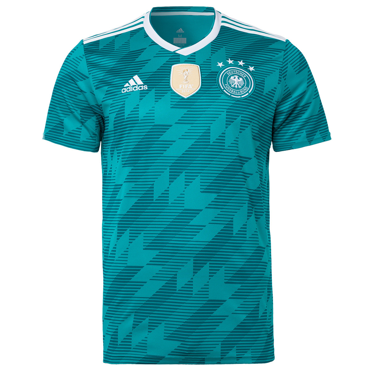
Like all of the other current Adidas designs, the three stripes are only on the shoulder, and do not extend down the sleeves. The overlapping white V-neck collar is another old school style, first seen on the green shirt during the mid-1980s and, of course, on the 1990 version.
Complex yet simple
The overall look of the new Auswärtstrikot may appear complex at first glance, but it is essentially a composite tiling of the very simple design seen on the home shirt – the same three “shades” created by black horizontal lines of decreasing thickness.
Like the home shirt, there are no additional colours, confirming the break with more recent tradition. While the home shirt does include a small stylised Schwarz-Rot-Gold device on the inside of the neck, the away shirt is good old fashioned teal and white. There is no special trim, no flags, and no other stylistic devices. Even the “Die Mannschaft” logo at the top of the plain teal back of the shirt is in white.
The only thing that does not necessarily fit into this crisp and stylish colour scheme is the FIFA Champions patch. Nestled neatly enough (though one could say shoehorned) between the Adidas logo and the national eagle device, the large pale gold patch does make things look a little cramped.
Traditional colour combination
The new home kit has seen a return to tradition with the famous white-black-white colour scheme, and the away version continues down the same old school path. Green shirts with white trim. White shorts with three green Adidas stripes. Green socks with the traditional Adidas three rings at the top. Simple, and effective.
The 1970s retro video game name and number font may not be every fan’s cup of tea, but it works well with the overall look and feel. If anything the “Binatone” font works better with this green Trikot than it does with the white one.
The overall look will probably divide opinion, but I have the feeling that this could become a real classic.